PRESENTATION: Al Held-About Space
 An important figure in American post-Abstract Expressionism, Al Held is best known for his large scale, Hard-edge paintings. While Held’s sharp contours, geometric forms and clarity of vision are emblematic of post-painterly abstraction, his distinctive embrace of depth and spatial illusion defies neat categorization. Unlike other Hard-edge practitioners, Held’s work rejects reductive geometric flatness in favor of a uniquely architectural aesthetic, both in scale and its suggestion of intricately scaffolded space.
By Efi Michalarou
Photo: White Cube Gallery Archive
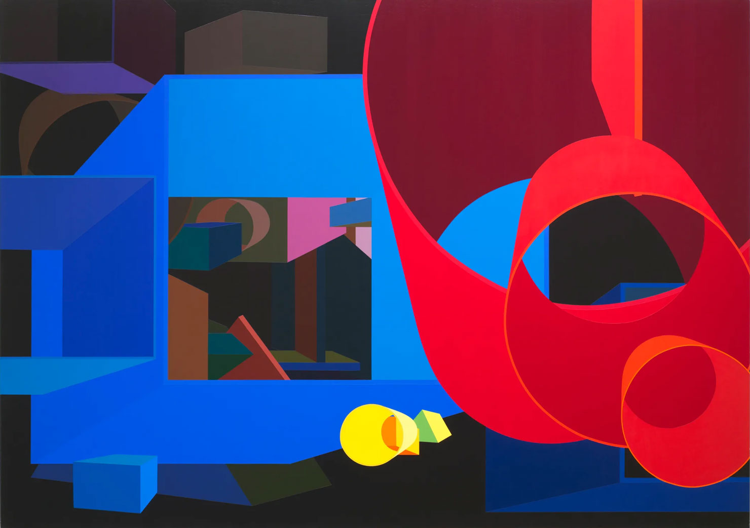
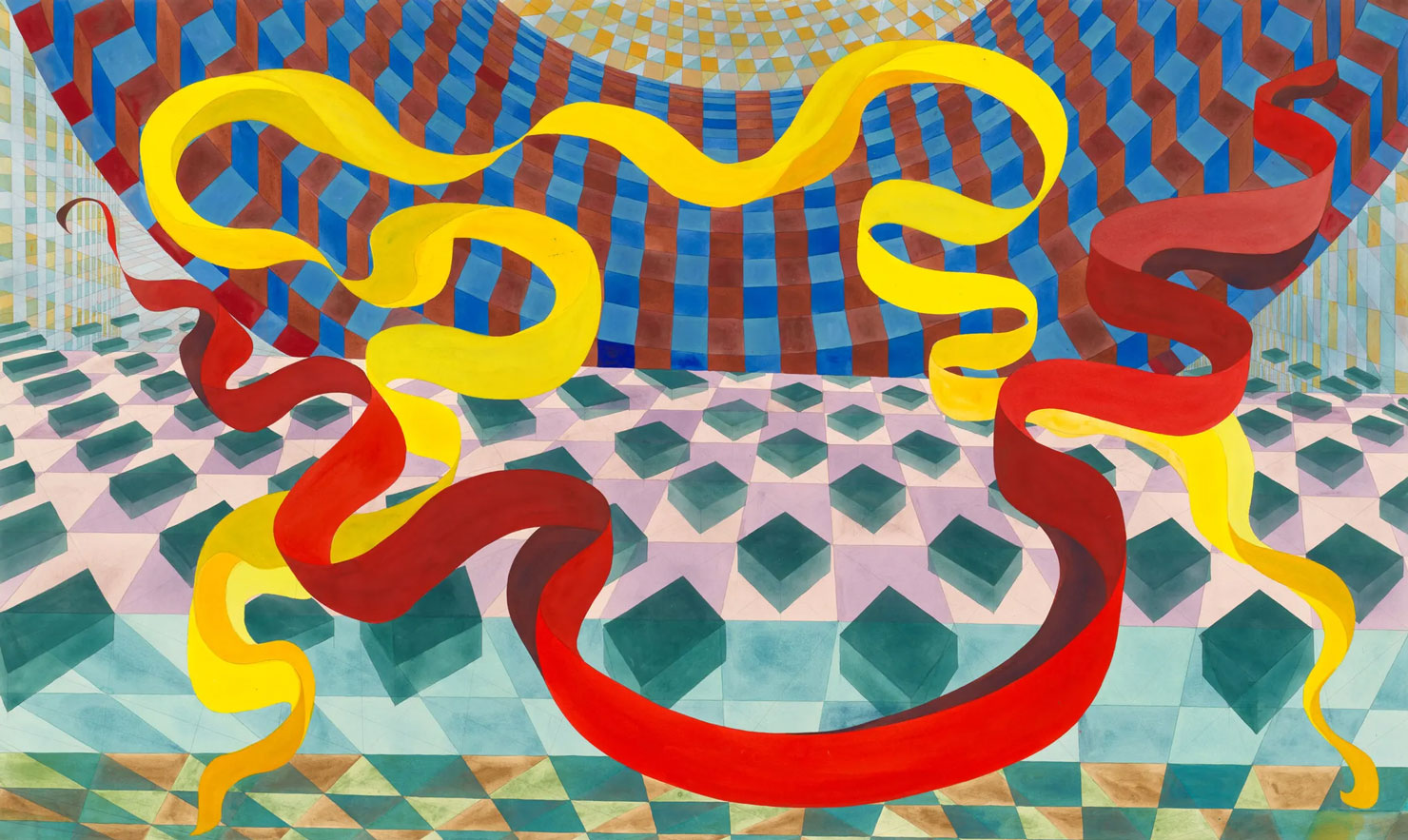
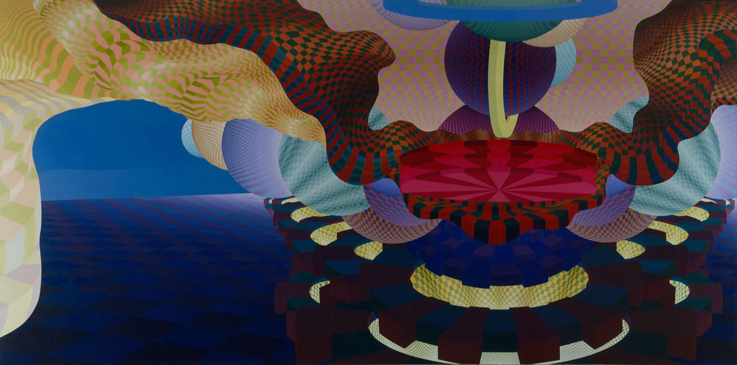
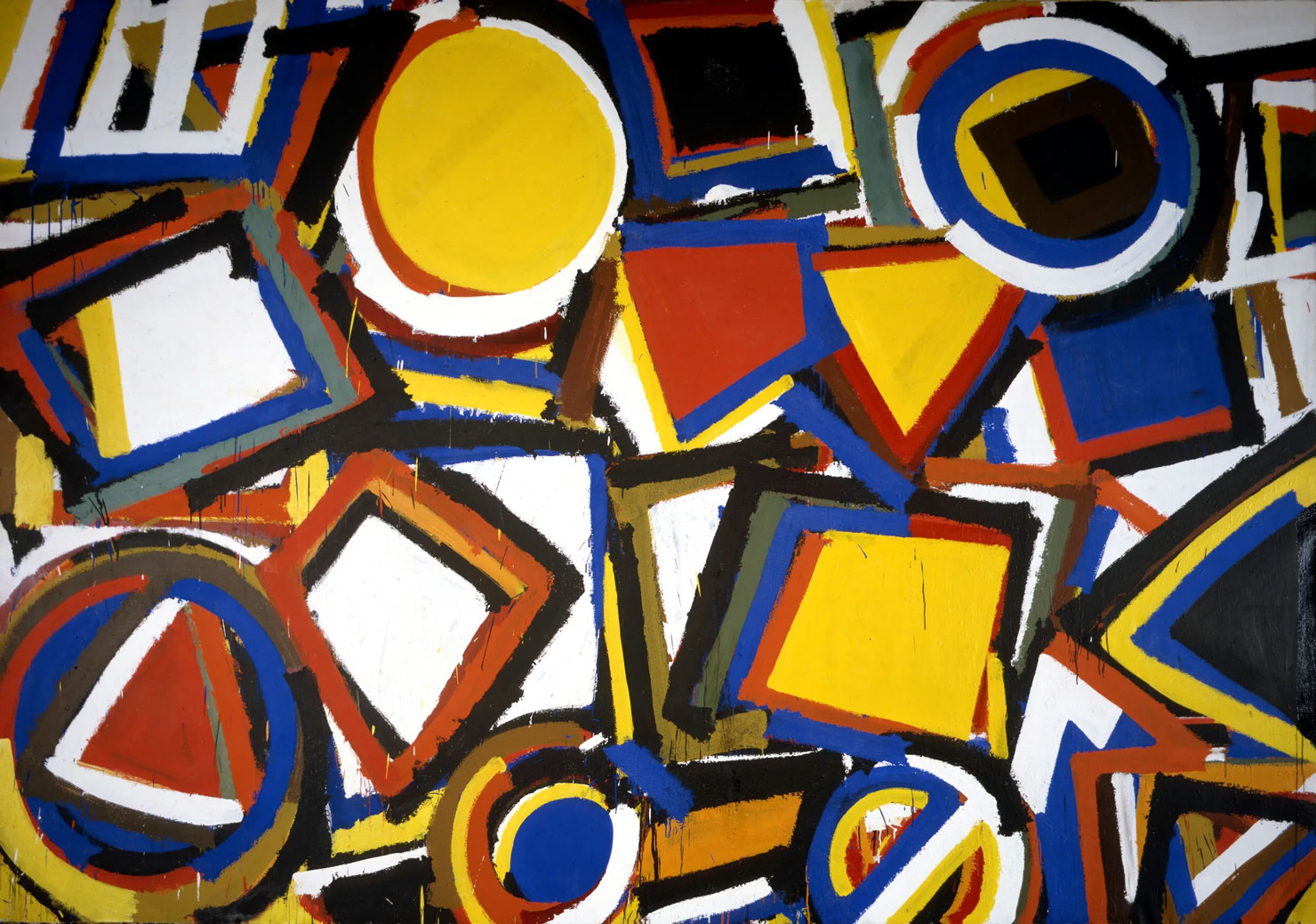
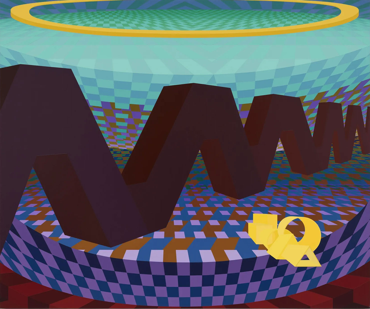
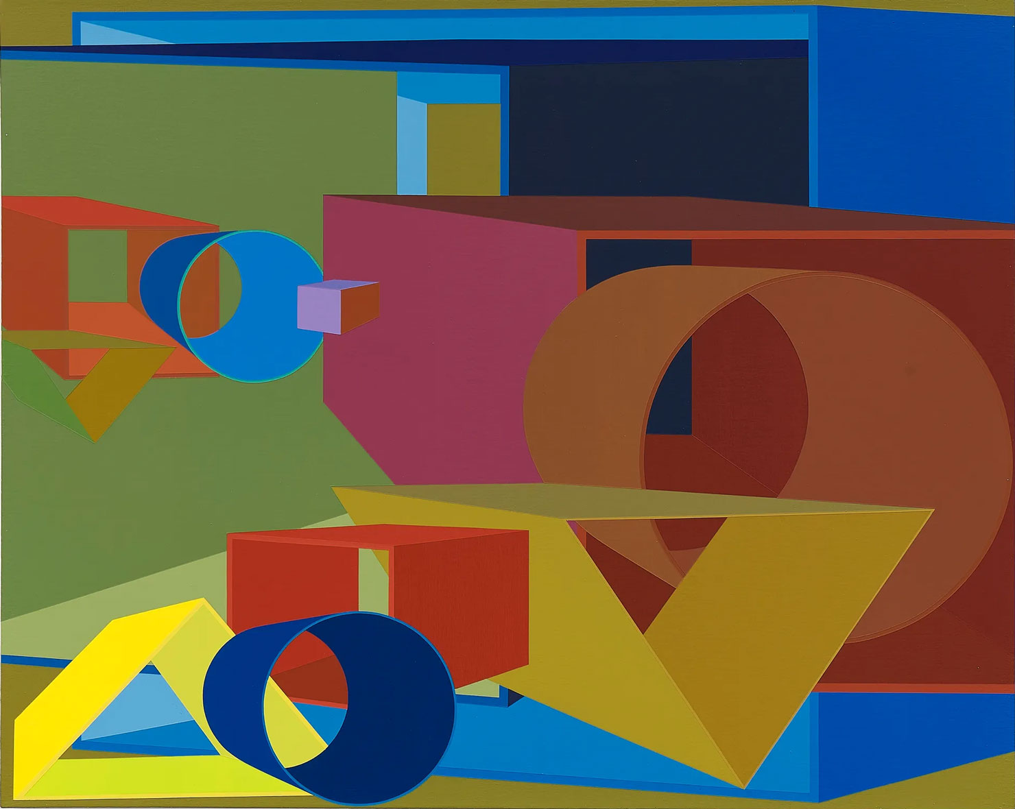
The exhibition “About Space” surveys the trailblazing practice of American painter Al Held (1928–2005). With roots in Abstract Expressionism, Held sought and realised novel modes of form, space and color, navigating spatial complexity through a combination of hard-edged geometry and spontaneous gestural expression. This exhibition unveils masterworks from seminal series spanning the artist’s career – from the vibrant expanses of his “Taxi Cab” paintings (1959–60) to the hyper-real spaces of the “Luminous Constructs” (1985–2005). During the late 1950s, gestural painting was something that Held had begun to lose interest in. He and a few other artists such as Morris Louis and Kenneth Noland felt a growing problem emerge. The style had brought a large number of mediocre artists and become overdone for them.[10] By 1960 he had succeeded in finding an alternative method given the label hard edge. In other ways it has been described as post-painterly abstraction, new abstraction, and cool art. The famous exhibition organizer Irving Sandler has been known to characterize it as concrete expressionism. The development of this style also led Held to change his medium from oil to a water-based acrylic. These paintings had vivid colors geometric configurations around positioned throughout the canvas resembling a mural. With these works Held takes concrete abstraction to its extreme. Around 1961-1966 Held created large abstract letters of the English alphabet. These paintings were given the titles The Big ‘N’, The Big ‘X’, etc. There is a delicate alteration of the letters as Held plays with viewers perception’s by changing the figure to the frame. The letters themselves take over the canvas and colors within the works make them seem to lean forward and backward at the same time. It leaves the viewer to think about the ideas of space and form and how dimension plays a key role. In 1967 Held felt that he was being limited by the flatness of previous hard edge abstractions. He wanted a way to create more picture space in some way, however painting shapes onto shapes would constantly hide beneath one another. Therefore, Held believed that adding depth and making the shapes appear three-dimensional on the canvas was his best option. The works “Giza Gate II” and “Flemish IV” are good examples of this style. All of these works are composed in acrylic black and white. The quasi-geometric structures zigzag in all directions making complex shapes usually cubical. Despite the same consistency of content throughout the works each maintain a unique design of their own. Grid like elements started becoming more apparent suggesting structure similar to that of the framework in buildings. The paintings are in a way disorienting with their uncentered patterns and no place to gain perspective. As his art’s complexity grew the idea of his art to be deemed minimalistic became less of a dominant label. Another remarkable characteristic of these works is the scale. While Held was away from his studio in New York during the 1980s, he created a number of watercolor paintings in Rome.The perspective of the shapes created a sense of deep space by expanding into the canvas what seems like forever. These works test imagination with intersecting planes and large to small forms jutting in the picture. Held’s visual concept of infinity creates a need for the viewer to look inward on themself. Many of Held’s modern artwork includes large symmetric non-objective structures with vivid colors. Using an acrylic medium, he created interlocking scaffolds that overlap with a deep consideration of architecture. The ancient buildings of Rome and the idea of the renaissance inspired Held as he returned to New York. Describing Held’s images as “room” or “walls” makes sense, however, the art is non-objective and those may not be the best words to use. On one hand the work has architectural qualities but at the same time the planes of color are nonrepresentational and in a way cannot be grasped.
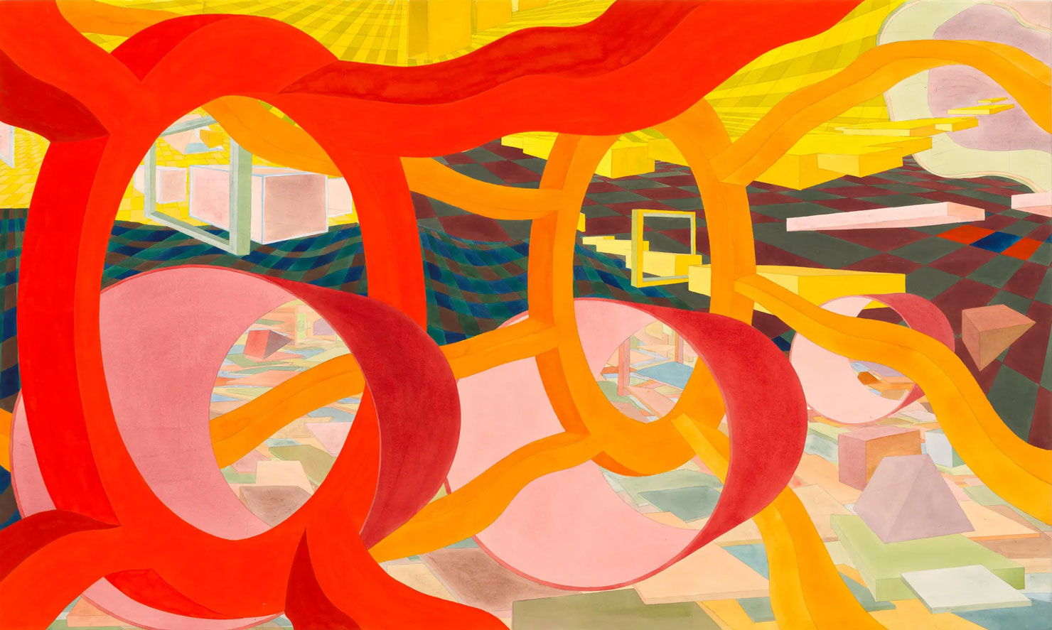
Photo: Al Held, Untitled 2003-2004, Watercolour on paper mounted on board, 127 x 210.8 cm | 50 x 83 in., 54 5/16 x 87 3/8 x 2 11/16 in. (framed), © Al Held Foundation, Courtesy Al Held foundation and White Cube Gallery
Info: White Cube Gallery, 144 – 152 Bermondsey Street, London, United Kingdom, Duration: 27/6-1/9/2024, Days & Hours: Tue & Thu-Sat 10:00-18:00, Wed 18:00-20:00, Sun 12:00-18:00, www.whitecube.com/
