ARCHITECTURE: Norman Foster, Part II
 Norman Foster came to prominence at a dour time for British architecture. Turning his back on the concrete “utopias” of the post war years Foster managed to “shake up” the architectural landscape with unconventional, “lightweight” and “calm”, designs formed of silver tubes and glass that allowed visitors to the building(s) to be at one with their immediate surroundings (Part I).
By Efi Michalarou
Photo: Centre Pompidou Archive
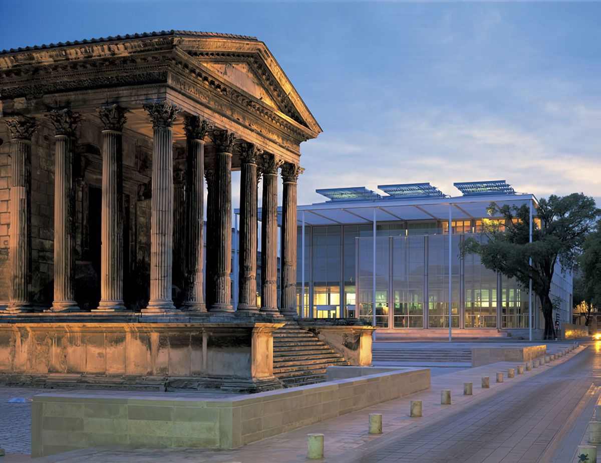
The retrospective exhibition dedicated to Norman Foster reviews the different periods in the architect’s work and highlights his cutting-edge creations, such as the headquarters of the Hongkong and Shanghai Banking Corporation (Hong Kong,1979-1986), the Carré d’Art (Nîmes, 1984-1993), Hong Kong International Airport (1992-1998) and Apple Park (Cupertino, United States, 2009-2017). The exhibition is designed by Norman Foster in collaboration with Foster + Partners and the Norman Foster Foundation. The layout unfolds in the course of seven themes, “Nature and Urbanity”, “Skin and Bones”, “Vertical City”, “History and Tradition”, “Planning and Place”, “Networks and Mobilities” and “Future perspectives”. Drawings, sketches, original scale models and dioramas, along with many videos, enable visitors to discover around 130 major projects. Welcoming visitors at the entrance to the exhibition, a drawing gallery showcases items never seen before in France, consisting of drawings, sketchbooks, sketches and photographs taken by the architect.Because they constitute Norman Foster’s sources of inspiration and resonate with his architecture, works by Fernand Léger, Constantin Brancusi, Umberto Boccioni and Ai Wei Wei are also presented in the exhibition, along with industrial creations, a glider and automobiles. Drawing gallery: The spontaneous concept sketch, which might seem like a blinding flash of inspiration, is most likely borne out of a total immersion in the many issues. For me, design starts with a sketch, continuing as a tool of communication through the long process that follows in the studio, factories and finally onto the building site. The drawing is a more premeditated exercise and the cutaway sectional perspective, along with three dimensional details that he favours, have their links to past influences. In 1975 Foster started the habit of carrying an A4 notebook for sketching and writing – a selection of these are displayed in the central cabinets, surrounded by walls devoted to personal drawings. A further cabinet contains back-lit transparencies which I have captured with a camera and they chart some of the diverse design influences over time. Nature and urbanity:These are two parallel worlds which intersect creatively. We can preserve nature by building dense urban clusters, with privacy ensured by design – the opposite of unsustainable urban sprawl. We can blend with the landscape by digging into it or leaving it undisturbed, by touching the ground lightly. By bringing nature into our cities and buildings we can humanise spaces with greenery, views, fresh air and natural light – more healthy, joyful and consuming less energy. The tree is a metaphor for the ideal building. It breathes and responds to changes in the seasons. It is inspirational as a cantilevered structure in harmony with nature. As a self-sustaining ecosystem, it harvests water and solar energy, recycles waste and absorbs carbon dioxide. These design principles date back to the nineteen sixties. However, in the last decade they have been scientifically proved to create environments which, compared to conventional practice, are more healthy and with improved levels of human performance. What is good for our spirit can also be good for the environment.
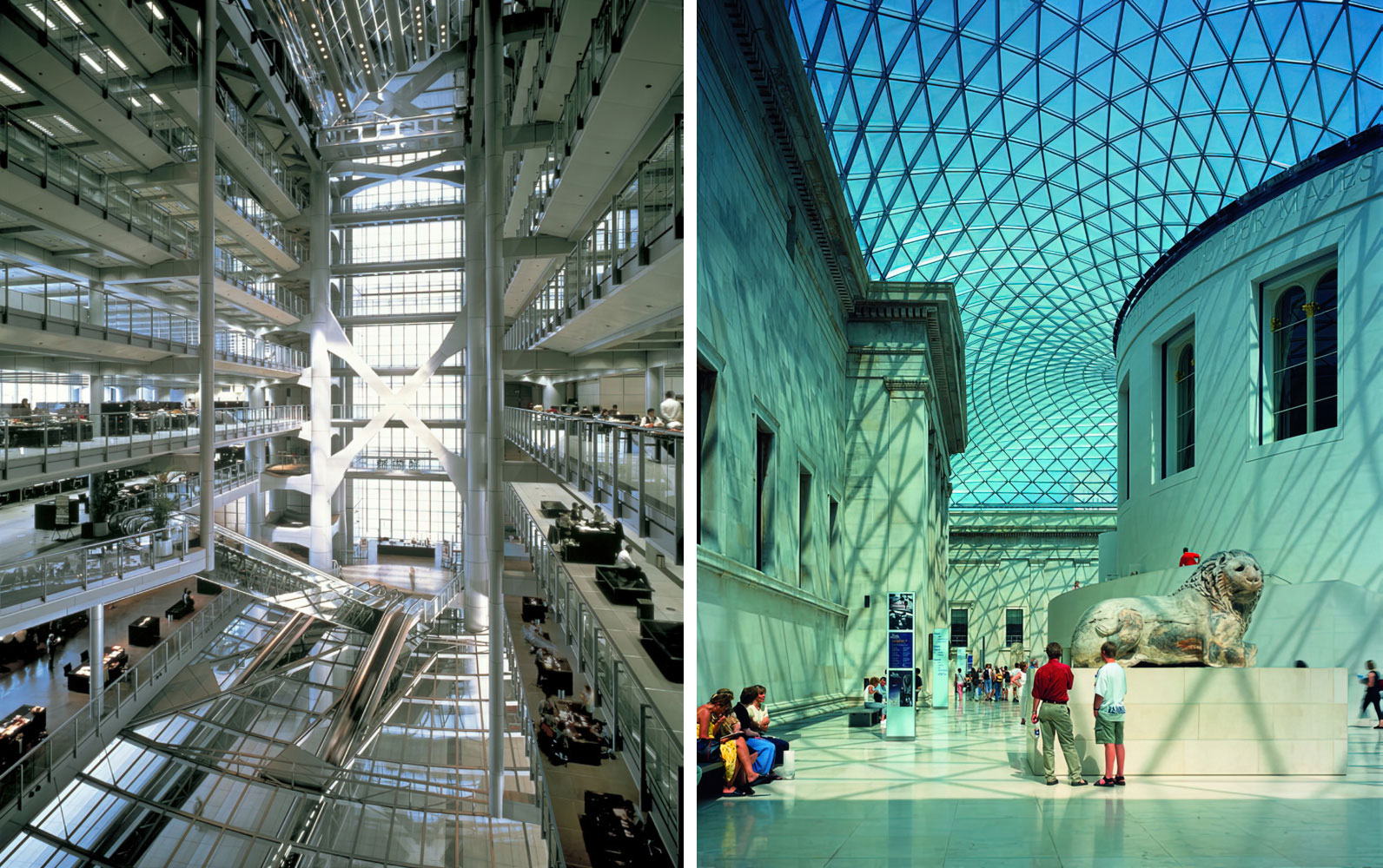
Skin and bones: It was an eminent critic who observed that all of our projects could be categorised as either skin or bones depending on whether the dominant external expression was of the smooth façade – the skin – or the skeleton of a supporting structure. This figurative expression is not arbitrary, rather it is the outcome of considering, in each case, the relationship between the separate systems of structure, environmental services and external cladding. The selection of projects to illustrate this theme is random – and from all of the other categories. There are parallels between architecture, art and design. In a medieval cathedral, the structure is the architecture,and the architecture is the structure, as in several of our towers. Links can be drawn with the white gridded structures of Sol LeWitt, and Fernand Léger’s construction workers in their network of iron girders. The smooth aerodynamics of our skin projects resonate with the streamlined forms of automobiles and sculptures by Boccioni and Brancusi, and bear comparisons with the world of aviation – the streamlined fabric of airships or the white composites of high performance sailplanes The vertical city: The skyscraper is emblematic of the modern age city and is a reminder that the city is arguably civilisation’s greatest invention. A vertical community, well served by public transport, can be a model of sustainability especially when compared with a sprawling low rise equivalent in a car dependent suburb. Our own design history of towers is one of challenging convention. The Architecture firm of Norman Foster was the first to question the traditional tower, with its central core of mechanical plant, circulation and structure, and instead to create open, stacked spaces, flexible for change and with see-through views. Here, the ancillary services were grouped alongside the working or living spaces. This led to a further evolution with the first ever series of ‘breathing’ towers. In the quest to reduce energy consumption and create a healthier and more desirable lifestyle, we showed that a system of natural ventilation, moving large volumes of fresh filtered air, could be part of a controlled internal climate. His tower design in the Yale Master Class was prophetic in its elimination of the central core.
History and tradition: It has been said that if you want to look far ahead to the future, first look far back to in time. This advice applies to many of our historic projects where the designs are rooted in a study of the past. Recycling an existing building, particularly one of civic importance, is far more sustainable than building afresh. Historic structures are typically marked by layers of growth – each of its own period – and our approach has been to continue that pattern with a respectful imprint of today, rather than a pastiche of the past. Tradition in architecture overlaps with history and for me it is the vernacular or indigenous tradition – once described as Architecture Without Architects. It fascinated me as a student and led me to measure and draw a medieval barn and windmill. The vernacular continues to inspire me as a design influence – not only in its forms but in the use of materials and the environmental lessons of cooling and heating before an age of cheap energy. Planning and places: Placemaking is related to the world of urban spaces – it is the infrastructure of streets, plazas, parks, bridges and connections – the urban glue that binds together the individual buildings and determines the DNA or identity of a town or city. Place is also the spirit, even if not spiritual by its origins. Infrastructure is at the heart of masterplanning and can generate, transform or reinvent a city or region. It can respond to crises from which, historically, cities have always emerged stronger. It can encourage the community of neighbourhoods and, by urban design interventions, show how small changes can deliver major environmental gains. Masterplanning can encourage the compact, sustainable, walkable and equitable city. It can bring nature and biodiver-sity, whether as a protective green belt, in parks, avenues of trees or dispersed through the urban fabric to beautify and to clean the air we breathe.
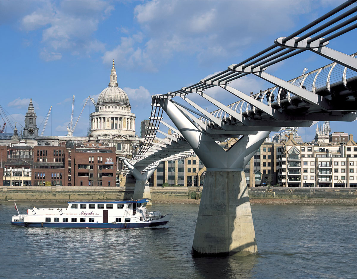
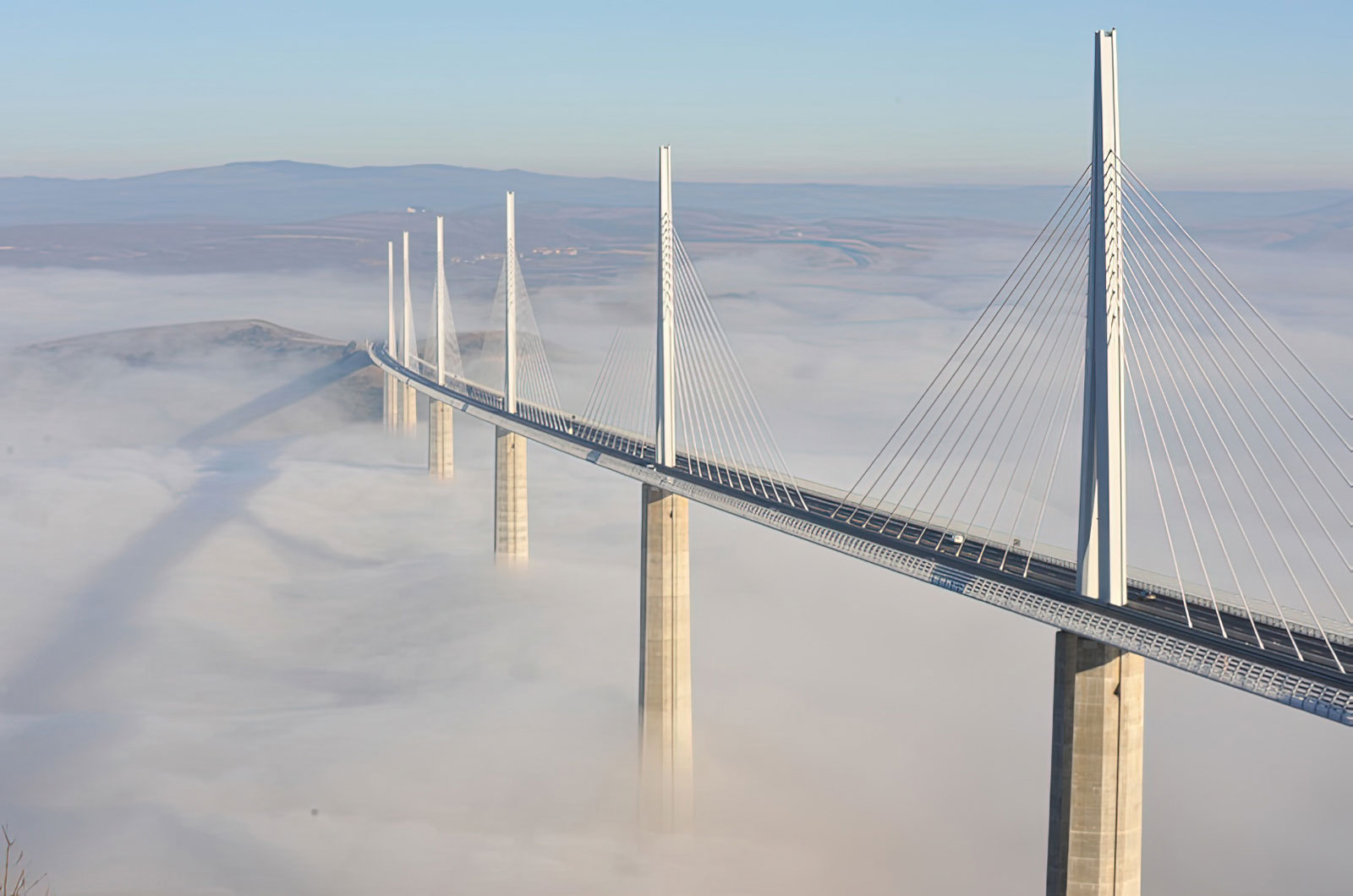
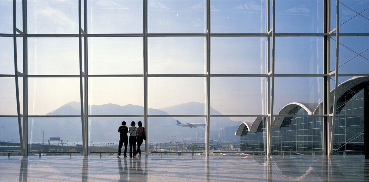
Networks and mobility: Mobility of people, goods and information needs physical infrastructure, whether down on earth, aloft in space or on another planet. The growth in air travel, alongside high-speed rail networks, has provided us with the opportunity to reinvent the international terminal – to elevate it as the gateway to a nation, with all the attendant symbolism – to open it up to the sky for delight as well as savings of energy and maintenance. Bridges that connect riverbanks or plateaus in the landscape also have an heroic and symbolic dimension, and have led us to structural innovation in the pursuit of visual lightness and identity of place. Even the digital world needs to come down to earth in the transmission tower which offers similar scope for reinvention. Futures: This section overlaps with “Networks and Mobility” but is projected ahead in time and space. It anticipates a more autonomous world where clean energy sources are abundantly available – free from transmission grids and mega power stations. The Norman Foster Foundation is working on this concept with MIT’s Centre for Advanced Nuclear Energy Systems. A similar trend is apparent in mobility with autonomous self-driving systems. There are parallels with the recent revolution in telecommunications as satellites and handheld devices have replaced telephone exchanges and endless poles and cables in the landscape. Working with the European Space Agency and NASA, we have explored Lunar and Martian habitations. The dome-like structures have visual similarities with the system of droneports that we proposed for rural Africa – both use the earth of their locality as prime construction materials and all, literally, grow out of their sites. The science fiction fantasies and inspirations of my youth are the project realities of today.
Photo: Foster + Partners, le Viaduc de Millau, Millau (France), 1993-2004, Photo : © Ben Johnson
Info: Curator: Frédéric Migayrou, Centre Pompidou, Place Georges-Pompidou, Paris, France, Duration: 10/5-7/8/2023, Days & Hours: Mon & Wed-Sun 11:00-21:00, www.centrepompidou.fr/
Right: Foster + Partners, Hearst Headquarter, New York (USA), 2000-2006, Photo : © Chuck Choi
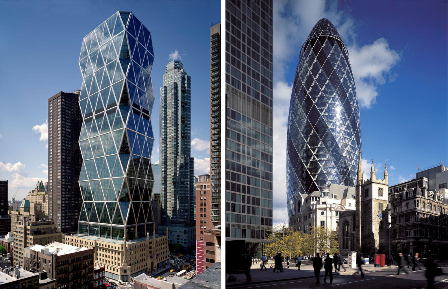
Right: Foster + Partners, St Mary Axe, London (England), 1997-2004, Photo : © Nigel Young Foster + Partners
