ART-PRESENTATION: Meg Cranston-Hue Saturation Value
 Meg Cranston investigates the intersections between individual and shared experience and how imagery and objects acquire meaning in our culture. Equally enamored of the diverse aesthetics of color theory, design, fashion, and supermarket advertising, she makes energetic collages pairing found imagery with monochromatic abstract forms. While often taking personal attributes or historical events as a jumping-off point, Cranston’s work is equally concerned with the formal language of art and the role the artist plays in helping us see the world in new ways.
By Efi Michalarou
Photo: Meliksetian|Briggs Archive
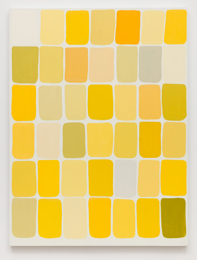
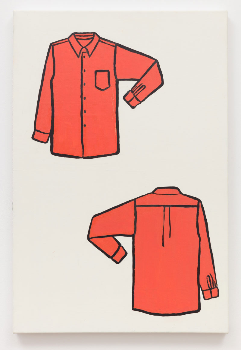
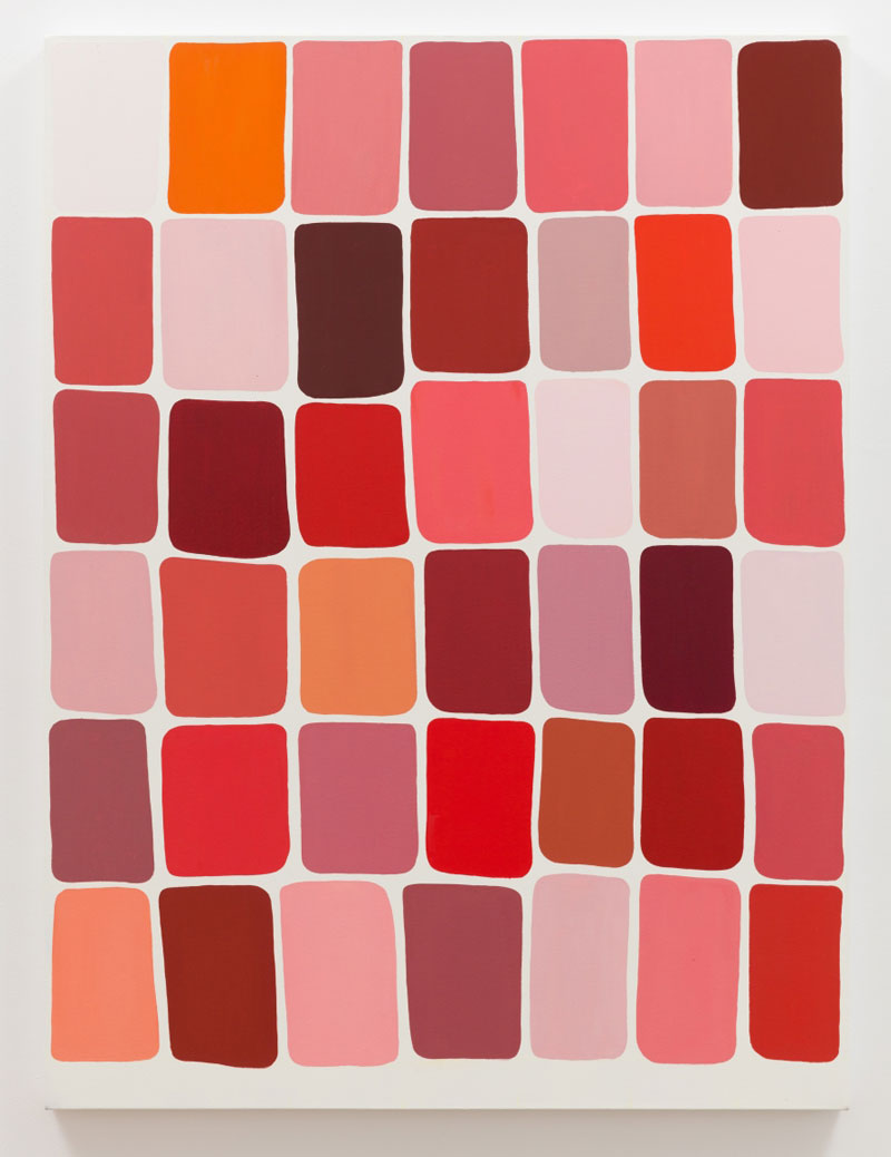
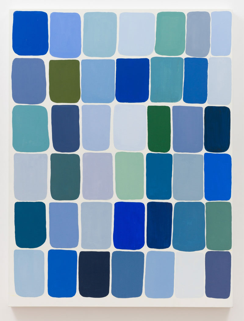
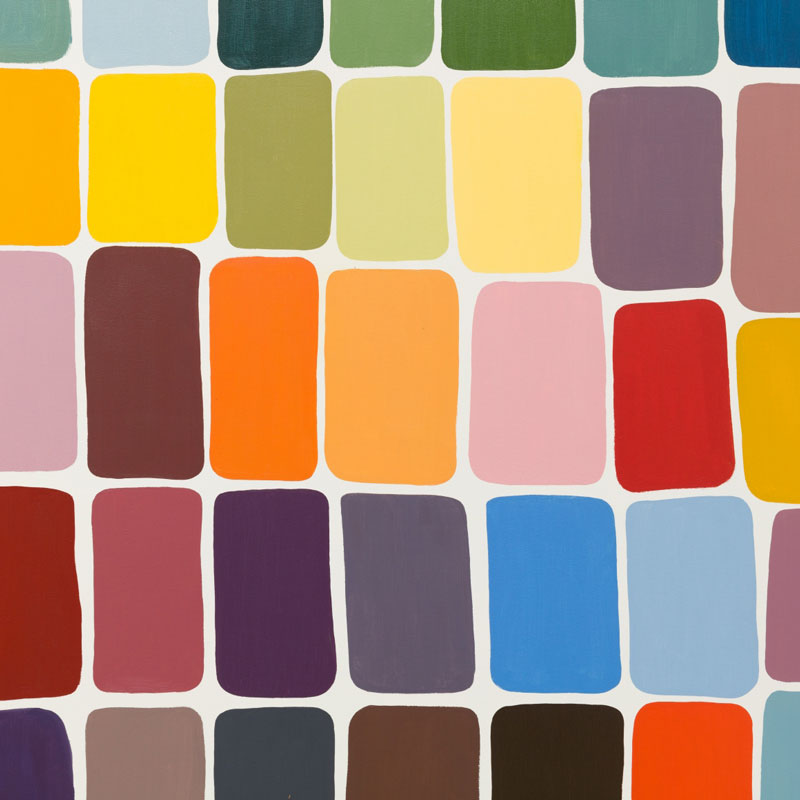
Meg Cranston’s five paintings that are on presentation at her solo exhibition “Hue Saturation Value: The Archer Paintings” developed out of an invitation Cranston received to do an exhibition at Los Angeles’ Archer School for Girls, continue Cranston’s ongoing investigation into color theory and its cultural ramifications, the legacy of modernism, individual and shared experience and highlight her idiosyncratic approach to art making. The paintings were created to present Archer students with an array of color choices and allow them to vote for their favorites. It was an experiment to see if girls aged 10-18, (who are the most targeted consumers of fashion and cosmetics) would select colors similar to those dictated by the industrial color industry notably, the Pantone Corporation, or, have different choices. They were also asked to supply names for the colors. Three of the paintings are based on primary colors, red, blue and yellow, and a fourth represents the “full spectrum” of color created from those primaries. By adjusting the level of white, black and the addition of complementary colors, Cranston experiments with the nearly infinite variety of tints, tones and shades of any given color. The title of the exhibition refers to the three main properties of color, hue, value and saturation with saturation having a double meaning both as chroma and industrial ubiquity. After the voting was complete, Cranston used the results to create the final painting for the exhibition, “Mr. Moseby’s Salmon Not Pink Shirt” The title was written by a student to describe one of the top voted colors: #60 – a red/orange hue that is nearly identical to Pantone’s 2019 color “Living Coral”. Cranston investigates the grid in this latest body of work, a fundamental and defining element of early 20th Century art, her grids are idiosyncratic, the mathematical and structural precision and rigor of those used in, say, minimal or conceptual art, subverted by Cranston’s personalized and handmade approach to their formal logic. The colors in the works being chosen by “popular demand” as it were, reflect Cranston’s interest in shared experience, the cultural conditioning of our tastes and preferences in the realm of color, often influenced by wider cultural trends such as fashion in particular, and the subtle yet powerful influence of corporations like Pantone LLC.
Info: Meliksetian|Briggs, 313 N Fairfax Avenue, West Hollywood, Duration: 12/1-2/3/19, Days & Hours: Tue-Sat 12:00-17:00, www.meliksetianbriggs.com
